
Putting a logo on a box sounds like the simple part of a packaging project. The structure gets argued over for weeks, then the logo goes on almost as an afterthought. That order is backwards, because the logo is the only element a customer is guaranteed to see, and the decisions that decide whether it looks considered or careless are made long before anyone chooses a printing process.
There are three of those decisions. Where on the box the logo sits. Whether it survives being scaled down onto a smaller box in the same range. And how much of the surface it should occupy. Printing methods matter, but they are downstream of those three, and getting them wrong is expensive to reverse once the plates are made.
Start with the dieline, not the artwork
A dieline is the flat layout of a box before it is folded, showing every cut, crease, tuck flap and glue seam. If you design the logo before you have one, you are decorating a rectangle and hoping it lands somewhere sensible on the assembled box.
The failures this causes are consistent and avoidable. A logo that crosses a crease will crack along the fold on a coated stock, because the ink film is brittle where the board bends. A logo placed on a tuck flap disappears whenever the box is closed, which is how it will be seen on a shelf. Artwork that runs into the glue seam gets partly swallowed when the box is assembled, and nobody notices until the first production run arrives. On a rigid box, where the printed paper wraps around the board, the artwork also has to allow for the wrap travelling over an edge, which can pull a logo slightly out of position.
The fix is straightforward. Ask for the dieline before you finalise anything, place the artwork on that flat file, and mark clearly which side faces up when the box is closed. Designers who have not worked on packaging before almost always underestimate this step, and it is the single most common source of reprints.
Where the logo goes changes what it says
Placement is a branding decision rather than a technical one, and the right answer depends on how the customer meets the box.
On the lid top, the logo is seen when the box is closed. This suits gifting and keepsake packaging, where the box is on display and the mark does the work before anything is opened. On the front panel, a retail facing, the logo competes with whatever is beside it on the shelf. On the side panel, the logo is what identifies the box in a stack, which is why e-commerce brands often put the mark there and keep the top plain. Printing the inside of the lid adds a second surface, and it lands at the moment of opening, when attention is highest.
There is also a question of how much space the logo should take. A large logo shouts, which works for mass retail and reads as cheap on a premium product. A small mark on a well-chosen material reads as confidence, and it is the approach that suits uncoated kraft, coloured stock and rigid boxes with a good wrap, because the material is doing part of the talking. Busy artwork on a plain brown box tends to look like a compromise, while a single well-placed mark looks deliberate.
Making one logo work across a family of boxes
Most brands do not print on one box. They print on a range that spans a large gift box down to a small accessory box, and the same logo file rarely works on all of them.
The problem is that detail disappears as size drops. Thin strokes, small counters inside letterforms and fine taglines fill in, and a logo that looks crisp on a large carton turns into a smudge on the lid of a small ring box. There are practical limits to how small a mark can go before it stops reading, and those limits are tighter on uncoated or textured stock than on a smooth coated sheet.
The workable approach is to build two or three versions rather than forcing one. A full lockup with the tagline for large surfaces, a mark-only version for small ones, and possibly a wordmark alone where the shape does not fit. Then define a minimum printed size for each version and a clear space around it, and treat those as part of the brand rules. A brand that has never done this will usually find that its existing logo file contains a tagline that has never once been legible on the actual packaging.
Consistency across the range matters more than any individual box. A customer who buys three products should recognise all three boxes as the same brand before reading anything.
What the board does to your logo colour
Colour behaviour is where packaging surprises people who are used to designing for screens.
On a coated white sheet, what you approve is close to what you get. SBS board and duplex board both present a clean, bright surface that holds colour predictably, which is why brand guidelines built around exact colour matching tend to specify them. On uncoated kraft, coloured stock, or a holographic or metallic wrap, the substrate participates in the result. Ink on brown fibre shifts warm and loses contrast. Light colours sit on top of the board rather than inside it, so they need an opaque white underlay printed first, and that adds a pass to the job.
Two strategies keep this manageable. The first is to choose substrates that suit the ink you have rather than the other way round, so a brand with a strong single colour and no photography is often better served by coloured or kraft stock with one dark ink than by four-colour printing on white. The second is to treat the material colour as part of the design instead of something to cover up. On rigid boxes the base board is never printed at all, since the printed paper or foil is the wrap, and the choice between a metallic wrap and a textured linen one changes the logo’s character more than any ink decision.
Printed logo versus applied branding
A printed logo is one option among several, and for a premium box it is often not the strongest one.
Foil stamping uses heat and pressure to bond a metallic layer to the surface, and it reads as clearly more expensive than ink. Embossing raises a design element so it can be felt, and debossing presses it in. Spot UV applies gloss to a specific area against a matte background, which makes a mark catch the light in one place. Foil edging puts metal on the box edges as a frame. Combination embossing pairs foil with a raised surface. Screen printing applies a solid, dense layer of colour, which suits a bold single-colour mark better than a process print does.
Each of these is a separate production pass with its own setup, so cost accumulates quickly. The useful way to think about it is what the logo needs to survive. A mark that must be felt through the surface suits an emboss. A mark that must look valuable at arm’s length suits foil. A mark that must simply be legible and consistent suits ink, and paying for foil on a box that gets thrown away in a week is money that would have done more elsewhere. On a gift box that gets kept, the same spend is easier to justify.
Where logo printing is not worth the money
Some boxes should stay plain, and recognising them saves real budget.
A shipping carton that is opened with a knife and discarded the same day is a poor place to spend on finishing. A plain brown mailer with one ink mark is legible, recognisable and cheap, and it will look better after a week in the postal system than a foil-stamped box that has been scuffed. The same logic applies to any packaging that a customer never consciously looks at.
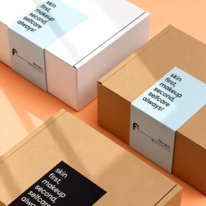
Where logo printing is worth the investment, a few things consistently earn their cost. One-colour printing on stock that suits it, which gives a clean result without a four-colour setup. A belly band, which is a printed sleeve wrapped around a plain box, because it brands the box at a fraction of the cost of printing the box itself. A printed inner surface on a gift box, because it lands at the moment of opening. Tissue paper and a card inside, which cost very little and are seen at the same moment.
What rarely earns its cost is complexity for its own sake. Multiple finishes on a small box, four-colour artwork on a dark substrate, or a logo sized to fill the panel because it fits. Each of those adds spend without adding recognition, and recognition is the entire point.
What to send your supplier
Most of the delay and rework in logo printing comes from what arrives in the first email.
Send vector artwork rather than a screenshot or a JPEG, because a raster file has a fixed resolution and cannot be enlarged without softening. Send it placed on the dieline rather than as a standalone image, so the supplier can see exactly where it lands relative to the folds. State the colour references you expect rather than describing them, and say which surfaces carry the logo and which stay blank. Give a minimum reproduction size so nobody shrinks it below legibility.
Then ask for a physical proof rather than approving from a screen. Colour on brown fibre, the depth of an emboss and the sheen of foil all behave differently in the hand than on a monitor, and this is the last moment when a change is cheap. Most suppliers, including this one, provide design assistance at no cost, and it is worth using it to check the dieline placement before anything is committed.
Questions people ask about logo printing
Can I print my logo on kraft or coloured board?
Yes, and it often looks better than on white. The constraint is contrast and colour shift. Dark inks hold up well on brown, while light colours usually need an opaque white underlay printed first, which adds a pass and a cost. Designs that use the board colour as part of the artwork work best.
What file should I send for logo printing?
A vector file, placed on the dieline, with the colours specified by reference rather than by eye. Vector artwork scales without losing sharpness, which matters as soon as the same logo is printed on boxes of different sizes. A flat raster export will not scale.
Is foil stamping better than a printed logo?
It is different rather than better. Foil reads as more expensive and catches light, which suits a premium gift box that will be kept. Ink is cheaper, more consistent across large areas, and more legible at small sizes. Many brands use both, foil for the mark and ink for supporting text.
If you are planning a first order with a logo on it, the custom rigid boxes page sets out the wrap, finish and insert options that change how a mark reads, and the kraft box range shows what one-colour branding looks like on uncoated stock. For folding cartons, the tuck box styles cover the structures most logos end up on.