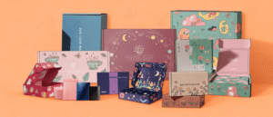

Most packaging fails at branding for the same reason: the brand was added to the box instead of the box being built from the brand. The logo lands on the front, a color gets sprayed around it, and the rest is covered in finish. The result reads generic from three meters away and from thirty centimeters. Effective branding works more like plumbing than decoration. It is a set of decisions made before any artwork exists, so that every face, color, and texture on the box points the same way. This guide works through those decisions in order, and where each one costs money.
Put the brand system on paper first
Before the style is chosen, write down the rules the box has to obey. Logo: which version works at packaging scale, and in what color. Type: which one or two faces carry headlines and which carry the small print. Color: the exact values, and which single one is non-negotiable. Tone: the register the copy should speak in, because the back panel gets written too. Assets: whether the brand has photographs and patterns at print resolution, or whether the design must be typography-driven. These five answers are what you hand to a design team and the checklist you hold a prototype to. Without the list, a box gets designed around whatever looks good on a screen, and a screen is not a box. Paper soaks ink, lamination shifts a hue, and a color that holds at thumbnail size falls apart at full coverage. The design fundamentals behind this step are in how to design custom packaging boxes for your brand. A system this size takes a day to write and saves the whole run from being one color off.
Decide what each face says
A box has four working faces, and each one has a job. The front carries the three-second read: logo, product name, and the tagline if there is room for one line of it. Nothing else. The side panels carry the argument: features, benefits, how the product is used, the reason to pick this one over the neighbor on the shelf. The back is the information panel: ingredients or specifications, company details, the fine print that has to be there, set small. The bottom is the utility face: barcodes and manufacturing details, the cheapest square inch on the box and the right home for information nobody wants to look at. The hierarchy matters more than the graphics. A front panel crowded with icons, badges, and claims reads as busy at shelf distance and cheap at hand distance. The standard allocation is in the custom tuck boxes guide, and it holds from a tuck end to a two-piece rigid. The practical consequence: the front panel has the least room for error, so it is where the color accuracy budget belongs.
Make the color actually hold up
Print color works in two modes, and choosing between them is the first real money decision. Process color, CMYK, mixes four inks and does the honest work: full-color photography, gradients, anything with a range. Spot color, matched to a Pantone value, is a pre-mixed ink that hits one specific shade. It is the tool for the brand color that must be identical on the box, the product, and the storefront, because CMYK drifts between presses and jobs while a spot ink does not. The trade is real: a spot ink adds cost to a run, so buy exactly one, the identity color, and let everything else live in process. If the brand is genuinely multicolor, keep the multicolor in the logo and anchor the box with that single spot so the system has a constant. For volume runs, offset is what the mailer box range calls the gold standard, because brand reproduction holds across the job. Digital covers short runs and prototypes, which is how colors get tested before the big order. Pantone metallic adds shimmer and is the spend worth making on a prestige line. The method-by-method breakdown is in what printing methods are used for custom boxes.
Pick one signature finish and use it with restraint
The finish menu is long: gloss or matte lamination, soft-touch coating, spot UV, foil stamping, embossing, debossing, aqueous coating. The long menu is where branding budgets go to die: each extra process is its own line item, and a box covered in every effect looks like a sample board. The fix is to choose one signature finish, the one matching the texture the brand already claims, and apply it to a single element. A spot gloss logo over a matte field is the classic move: the contrast does the premium work and the gloss guides the eye to the mark, for less than full-coverage foil. Soft-touch is the right call for tactile products, because the velvety surface carries the in-hand moment gloss cannot. Anti-scratch lamination is the unglamorous pick for boxes handled a lot in fulfillment and delivery; it protects the print you just paid for. Foil and embossing earn their place on kept boxes, where the texture is touched every time the lid opens. The rigid box range lists the full menu, from textured wraps in linen and soft-touch to metallic foils in gold, silver, and rose gold, and the restraint rule holds harder there, because a wrapped box is already branded by its material.
Treat the inside as the second storefront
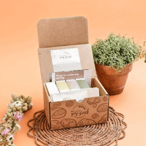
The outside gets three seconds. The inside gets the moment the lid lifts, which is when the box becomes a photograph, and photographs are how the unboxing travels. Interior branding is also cheaper per signal, because the inside does not have to survive a carrier and a lighter spec can carry the message. The standard toolkit from the custom tuck boxes guide is custom-printed inserts, branded tissue, and a card slot for a thank-you note or a small offer. On rigid structures the menu widens: pockets and card slots in the base, a belly band that carries a seasonal theme without a new die, and ribbons or pull tabs that make the opening itself part of the show. A die-cut window shaped like the logo or the product is the most distinctive move available, and it turns a practical opening into a brand element. The rule is one deliberate surprise. Tissue, a card, and an interior print line that continues the outside design read as a system. Five stickers, a QR code, and a scratch card read as clutter.
Keep the system consistent across the range
One box branded well is a success. A range branded well is a brand. When the third product ships in the third style of box, the range reads as a family only if the system survives the style change: the logo position holds, the identity color holds, the type pairing holds, the panel roles hold, and the style is the one variable allowed to move. That is also where material becomes a language. Kraft is the standing shorthand for natural, eco-forward lines. A printed kraft exterior still carries a full brand design, so a sustainability subline reads off the shelf without a single leaf in the artwork. Bleached white board is the neutral canvas when the full-color range needs to lead. The product boxes catalog spans both ends, and a range should pick its material per product line, not per mood. When a season comes, change the artwork, the tissue, and the belly band, and keep the die. The tuck box guide’s checklist, same colors, same fonts, same tone of voice, is a range checklist first and a single-box checklist second.
Where the money goes, and where it does not
Rank the spend list by what the customer experiences. First, the spot ink for the identity color; a wrong logo color is a brand failure visible from the shelf. Second, the prototype: a physical sample checks color, feel, and fit before the run starts, and it is the cheapest insurance in the process. The product boxes flow is built around that proof step. Third, one well-made element on the inside. Fourth, a protective finish where the handling is heavy. The no-spend list is just as useful. Do not pay for four finishes on a box that costs less than the product inside it. Do not full-coverage foil a shipping box that ends in the recycling bin; the scuffs arrive before the second look. Do not print both sides of a structure whose inside is never seen. Do not chase a gradient to a spot color. Gradients are process work. And do not assume the order minimum or the lead time; both vary with the style and the level of customization, so confirm both with the supplier before the artwork is locked. The cost side of these decisions is in how to reduce packaging costs for your business.
Questions that come up when branding packaging
How many colors should I use on my packaging?
Two is the working ceiling for a clean system: the identity color plus a neutral, with process color reserved for photography. Every additional spot ink is a separate cost and a separate thing to keep consistent, so add a third only when a product line needs telling apart at shelf distance.
Should my logo be full color or single color?
Single color is the stronger tool when the logo works as a mark: one spot ink, an exact color, identical on kraft, white board, or a wrapped rigid box. Go full color only when the mark is multicolor by design, and anchor the box with one spot so the system has a constant.
Is foil stamping worth the cost?
On a kept, displayed box, yes: the finish is touched every time the lid opens, and that repetition is how it pays itself back. On a box that ships and goes in the bin, no. The scuffs arrive before the second look, and the same budget works harder as matte lamination with a spot-UV logo.
Can a plain box still be well branded?
Yes, and often more convincingly. A plain kraft or white box with the logo in one spot color, a typed interior, and a card slot does the brand work with less surface to get wrong. Plain is a design decision that holds consistent across a range for less, and the kraft range exists because the approach works.
How do I verify the colors before a full run?
Order a physical prototype, not just a digital proof, and compare it against a brand asset already printed, such as a label or a card, in the same room and light. Digital proofs render differently from press, and a side-by-side in one light is the only test that shows the spot ink landed where it should.